Showing posts with label Lake District. Show all posts

Wednesday, 11 October 2017

Inktober 2017 - 'Run'

Staedtler Pigment Liners (various nib sizes) 
in 7.5" x 7.5" Handmade Sketchbook.
#Inktober, #Inktober 2017
[Legs from an internet photo; landscape scenery is mine]


I can hardly believe it's Day 11 already! Anyway, today's subject was 'Run' and I was not so sure of my final image but posted it anyway and by the end of today, I'd received 79 'likes' on the 'Inktober' FB page so I'm sitting here very humbled and hugely encouraged.

Tuesday, 3 January 2017

279. Simple Pastel Sketch of Cumbria

Charcoal and Schmincke and Unison soft pastels on 
Clairefontaine Pastelmat, 12" x 12"

Done in a rush!

Saturday, 10 December 2016

Ambleside in Pastel - Commission

Schmincke and Unison soft pastels on 
Clairefontaine Pastelmat, 12" x 12"

Here is a painting I handed over a week ago. I was happy enough when I was asked to do a landscape but absolutely thrilled when I learned it was to be a place that we know and love - Ambleside, Cumbria. I was asked to do an image of a place where this couple stay each year.  Thank you people, I really enjoyed doing it!

Friday, 9 October 2015

192. Cumbrian Lake

Lamy Safari Medium Fountain Pen in 
Handbook Travelogue Journal, 5" x 5" (x2)

Hah! Can you tell that I can't remember which lake this is? Shame on me! I'm not totally happy with the background perspective; somehow I've managed to make these majestic mountains look like hillocks. Ah well; I shall just have to draw another one! :)

Thursday, 8 October 2015

190. Dry Stone Wall, Cumbria

Copic 0.03 Multiliner pen
in Stillman & Birn Epsilon Sketchbook, 8.5" x 5.5"

Two great loves: my Stillman & Birn sketchbook and my Copic pen. I love the fine, wispy lines that can be created on this lovely, smooth paper. To sketch this image, I zoomed in on a photograph taken in Cumbria.

Saturday, 3 October 2015

189. Rainy Ambleside Sketch

Pilot G-Tec-C4 pen in an A5 sketchbook that I made

I was waiting for something this afternoon so just pulled up one of my many Lake District photographs and did a sketchy sketch from it.  I was struck by the very bright red lights on the  Range Rover and in the reflection so pulled out a red C4 and coloured them.

Friday, 18 September 2015

177. 'View Through a Window' Challenge

Pilot G-Tec-C4 on Handbook Travelogue Journal, 5" x 5" (x2)

This is No. 7 - I found some photographs I took through the car window when we were driving through the Lake District, Cumbria, a couple of years ago. (I was not the driver!)

Wednesday, 19 August 2015

173. Workshop - Coniston, Lake DIstrict, Cumbria

Schmincke and Unison Soft Pastels
on Daler Rowney Murano Paper, 16" x 12"

I was privileged to do another workshop with the enigmatic and thoroughly enthusiastic Impressionist pastel artist, Eiko Yoshimoto, at the Mall Galleries last week. We work from a selection of our own photographs because she dislikes seeing students walk out with ten identical paintings at the end of the day where they've copied the tutor's demo. I took the photograph below whilst in the Lake District in Cumbria. (Eiko always insists I sign my name "properly, not just initials!")

If you ever get a chance to study with her, please do; her teaching style is unique as she teaches using stories and analogies which, of course, you remember more easily.


Saturday, 14 June 2014

101. Misty Mountain


Derwent Charcoal Blocks on Clairefontaine Pastelmat, 
40cm x 30cm (c. 16" x 12")

Hi Everyone. I'm still experimenting with my charcoal blocks and have decided to submit this to the DPW Mountain Challenge this week. It's so strange working with a non-blue palette. (The colours in the box are Ochre, Sanguine, Mars Violet, Sepia, Black and White.) Again, I've broken the rules - this time omitting to add a bit of 'life' (such as a bird or a figure) as I want it to look quite barren.

Have a great weekend.

Friday, 16 May 2014

96. Going Somewhere


Landscape, oil on wood panel, 4" x 4"

I knocked this out before going off to a meeting. I used a mix of brushes and a painting knife. The title comes from my husband's comment: "Well, it certainly looks as though it's going somewhere!" 

Friday, 31 January 2014

71. Collage for '30 in 30' Challenge - January 2014


Collage of original oil paintings

Well here it is, my friends. Work, hospital and other things meant that I only managed 15 - I omitted the 'Eggs' work-in-progress (No. 64) as, small-scale, it looked too similar to the final piece. However, I actually did four times the amount I managed back in September and each one is an original so I'm happy.

I've just had a look at the other collages that are starting to appear on Leslie's blog and they are fabulous! Well done everyone, it's been great.

Happy February - I hope and pray we can all keep creating.  xx

Saturday, 25 January 2014

67. Day Twenty-Five: Another Whinlatter Landscape


Landscape, W&N alkyd oil on gesso-primed hardboard, 4" x 4"

Wow! Day 25! How are you all getting on? I had only a short time to paint this morning so knocked this out. I started out with a paintbrush but was taking too long so reached for the palette knife to get it done faster. A few weeks ago, I covered the support with Quinacridone Gold acrylic then put it to one side; you can see it peeping through the sky area and also where my initials are scratched out. 

Have a great weekend everyone.  xx

Tuesday, 31 December 2013

54. Autumn in Blighty


Landscape, W&N Griffin Alkyd oil paint on Arches oil paper, trimmed to 8" x 8"


Before trimming (9" x 9")

This is to be cut and displayed on mount board so I used alkyd oils for speedy drying. It needed an autumnal look to it and nearly all my paintings end up predominantly blue (as opposed to red or yellow) so I used the 'Zorn' palette (Cadmium Red, Yellow Ochre, Titanium White and Black*). I was very pleased with the nuances of colour achievable, including pale yellow and some good greens.

*  I wanted a black that was completely transparent so I mixed together Alizarin Crimson and Phthalocyanine Green. I thoroughly mixed it out with a small palette knife on a transparent party plate then tested it by adding white to ensure it was not biased to either red or green.  This gave me a very deep, luscious black without any chalkiness at all and resulted in a darker mix than the equally good Ultramarine Blue/Burnt Umber (or Burnt Siena) mix.

I agree that most mixes should still show a hint of their components but if I'm mixing two colours to get a third colour, the plastic plate has two benefits. I can turn it upside down to check that the two pigments have been blended completely - no streaks at the bottom of the mix - and I can also lay the 'palette' down onto a surface which is the same colour as the support I'm using to give an accurate reflection of how the paint will look on the actual painting.  My ground colour is often black, an umber (see previous post) or white so I usually have at hand a second support in the current colour placed under the transparent plate. Some artists paint their support and then the bottom of their glass or perspex palette; the party plate is less hassle and there is no clean-up or scraping off afterwards.

Phew!  If you've read this far, please will you let me know if all this information is helpful or if you'd prefer a shorter post? I'm happy to continue sharing my findings with you if you wish.

(Btw, Santa brought me a lovely present which I'll share with you soon!)

Happy New Year to you and your families.  x

Tuesday, 24 December 2013

53. Pink House, Cumbria


Landscape, oil on Pebeo canvas board, 30cm x 30cm (approx. 12" x 12")


Hello again, everyone.  I'm sorry I have not posted since mid-November (shocking!). Although I've done a fair bit of artwork, it was nothing I could post.  Some of it is for a friend's upcoming wedding, the last bit of which I finished yesterday so am now able to return to my own work for a while.

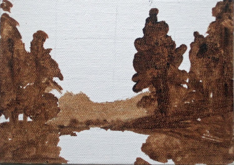
You may remember the underpainting above, done for Day 29 of Leslie Saeta's September challenge.  A week or so ago, I quickly blocked in some of the colour (middle image) but had to abandon it again until last night when I painted the distant mountains, tree, gate, road and finally the house.  I also tidied up the background trees and the dry stone wall.  I had originally shortened the fence (which in real life runs behind the gate and past the tree) but eventually ditched it altogether to achieve a more open space.

The only four colours used are from one of my major bargains - a pack of Royal Talens Rembrandt oils: Permanent Red Medium, Permanent Yellow Light, Ultramarine Deep and Titanium White.  I've heard it said that Rembrandt paints can be too oily but I get around that by simply using less medium than I would with, say, W&N paints.  My mix is Refined Linseed Oil, Stand Oil and Gamsol OMS at a ratio of 2:1:1 (Carol Marine's recipe).  I buy Gamsol from Stuart R. Stevenson on Clerkenwell Road in London - my first bottle was a free sample!  This time, I used two Liquitex brushes (soft, synthetic and great with oils) and a tiny palette knife for the pink blossom in the trees.

Anyway, thank you for visiting my blog and for reading this far!  I wish you a very happy Christmas and a prosperous and colour-filled 2014.  xx

Saturday, 12 October 2013

46. Trees on Whinlatter Pass


Trees on Whinlatter Pass, oil on W&N canvas board, 7" x 5"
This painting went into Leslie Saeta's '30 in 30' challenge nude!  I had only managed to finish the under-painting by the time the challenge was over.  It's done now though and I laid all the colour on top using a small diamond-shaped palette knife for speed.  I have corrected the background shape as it looked like a line of trees instead of a mountain range.  My initials were put in using a colour shaper which, believe it or not, was the fiddliest part.  Have a good weekend everyone! 

Friday, 4 October 2013

43. More Underpaintings


7" x 5", thinned oil sketch on Winsor & Newton canvas board

Included in my '30 in 30' collage for Leslie Saeta's September challenge but omitted to post separately here.  Hopefully, as they are small, I can complete them this weekend.  Have a good weekend everyone!

Tuesday, 1 October 2013

42. Collage for September 30x30


Ah well, I managed two full paintings and a few sketched underpaintings.  Thank you, Leslie; I might not have done any artwork had it not been for your challenge. 

Well done everyone else who painted anything at all.

Monday, 30 September 2013

Saturday, 28 September 2013

40. Fenceposts on Whinlatter Pass, Cumbria


6" x 6", oil on primed hardboard

Day 2 of my 30 in 30 (posted on Day 28!).  This is another view between the rain showers.  This is painted on hardboard primed with black gesso and left for a few weeks to dry thoroughly.  I roughly indicated the scene in light grey pencil then went straight in with a large brush and some Michael Harding paint.  The wire on the fence posts was done with a couple of palette knives (one diamond shaped and the other rectangular); I also used the little 'diamond' one to scratch in some foreground grasses.

Friday, 27 September 2013

39. After the Rain on Whinlatter Pass, Cumbria


4"x4", oil on primed hardboard.


 Blocking-in stage.

Well, four days before the end of Leslie's September '30 in 30' challenge, I at last have something to post; it's been impossible before now.  Thank you Leslie for encouraging us to post anyway.  (I may still do a final fiddle with the reflections.)
This is a view we saw when we were in the Lake District a couple of weeks ago.  England has some beautiful spots and the Lake District has some exceptional examples.  It rained a fair bit while we were there but it didn't ruin our visit.  The UK landscape tends to look very green and lush due to the damp weather and it looks and smells particularly good immediately after the rain has fallen.