Monday, 30 March 2015

126. Sketch for Tote Bag


Sketch of a pattern for a tote bag being constructed in
100% cotton (three different patterns)

Hi all, this is a sketch of what I've been up to for the past few days. For years, I've had a small tote/'sketching bag' which I take to the London galleries. I typically pack a large and a small sketchbook, some Coloursoft pencils, a small tin of water-soluble pencils, some fineliner pens, a brush-pen, a couple of erasers, a hairbrush and a packet of tissues. It all fits but it's a proper job to get everything back in quickly at the end of a session! So, I've decided to make a larger bag.

I looked on the net, found a typical tote bag pattern and decided to scale it up slightly. I've completely hand stitched it - the pocket is higher up. (I've just noticed an error in my written dimensions; can you arithmeticians see it??)

This is bringing back great memories of hand-stitching, hemming, etc, with my Mum who made everything from coats to ball gowns to hot pants (using a sewing machine, of course!) When I was little, I'd often go up to bed and there'd be beautiful fabrics laying on the floor and in the morning, magically, there'd be some fabulous garment on her tailor's dummy. She even once made a Russian-style hat from the off-cut left over from shortening a woman's fur coat. I'll never forget the owner's delight! (If you're interested, when the bag is finished, I'll post of photo.)

Monday, 23 March 2015

125. Cafe Sketch

Pilot G-Tec C4 water-soluble pen and
Neocolour II watersoluble wax pastels on
Saunders Waterford 140lb Hot Pressed paper block
Sketch size: 9cm(h) x 7cm(w)

This was actually drawn at home from my friend's photograph (we were 'sneaky-snapping' from a corner whilst in the cafe). I drew it as quickly as possible, as though at any time she might get up and walk out of the picture. At first, I was disappointed that my pen had run into the wax colour - I had picked one of my 'go to' pens (Pilot G-Tec C4, which I adore), instead of a waterproof one - but then heard Marc Taro Holmes call this effect "melting your drawings" (adding water to a sketch drawn in water-soluble ink) so I forgave myself - LOL!

NB. The Saunders Waterford hot pressed paper is wonderful. Both sides of the paper have been treated equally which makes it good for making sketchbooks. As it is 'hot pressed' watercolour paper, it is smooth enough for pen and pencil sketches yet it takes drawing inks and other water media beautifully.

Thank you for visiting my blog.

Tuesday, 17 March 2015

124. J's Book Restoration

Restored, hardbound and jacketed book

(There is only one rule in bookbinding:
The grain in the paper, cloth and board must run from head to tail.
City & Guilds)

Summary:  This is a binding I did for an elderly lady from church. The original is a softbound book dating back to 1983 with pages which have worn thin over the years. Slightly less than half of the paper front cover still existed and, although evidently well-loved, it was looking rather sorry for itself. She told me "I use it ever such a lot!" Because of what it is and its immense value to her (not to mention her immense value to me over almost three decades), I offered to rebind it for her. The original book was yellow so I chose saffron, yellow and cream for the binding. I wrapped it up in gold and yellow tissue papers and her daughter collected it yesterday. I should have photographed it from the very beginning really but set out below are some work-in-progress images.


Work in Progress and Detail

NB. You'll see another bound book in the photographs; this was my test piece. I used a fat, unwanted novel to replicate J's book and worked on that; once each stage had dried and I was happy, I then carried out that stage on her book. The only difference is that I used craft papers for the test piece instead of expensive book-cloth; all the other materials used on both books were proper bookbinding materials - acid free paper, greyboard, mull, EVA glue, etc.

Detailed Explanation:  First, I added an extra sheet of heavyweight cream paper to each end of the bookblock to protect it. This is called 'tipping in' which usually involves re-attaching a detached page with a thin strip of paste.


('Tipping in' an extra sheet)
In this case, I was merely protecting the book at each end before adding the end papers. I extended each page around the spine by 2cm so that when the page is opened you wouldn't see the book colour peeping through the endpaper and page, as is sometimes the case. 


(No book colour peeping through the join.)


I then attached the end papers to the soft spine in one continuous sheet of the same cream heavyweight paper. Once dry, I added the mull which is a lightweight but stiff type of gauze that holds the spine and endpapers securely in place. (Not shown here: I cut the ends of the mull at 45 degree angles so they'd look nicer if detectable under the endpapers.) After I'd set aside the bookblock to dry, I suddenly thought to add two dark-brown ribbon bookmarks and later attached them to the mull. The correct method is to paste them to the spine underneath the mull but I made sure they were secure.


Next I cut the greyboard leaving 5mm at the 'head' and 'tail' of the book. (I cut the width exact as there needs to be an overhang of 5mm on the 'fore-edge but the boards come inwards 5mm from the spine.) To add extra strength to the book-cloth, I pasted in some of the yellow card (always following the grain rule). This 'lining' also makes the book look more attractive and finished when you look down into the spine, especially on a wide book.


(A bit wrinkly before drying tight.)
('Saffron' book-cloth from Shepherds - gorgeous colour!)
I used the bone folder (previous image) to define the spine on the outside of the case.


Rounding the spine with the bone folder gives the case a nice shape.
(There's my test piece in the background all finished!)


(Very delicate masking tape holds the case in place whilst
the book-cloth dries around the greyboard.)
You can see the 5mm overhang on the tail and fore-edge and also the way the block hangs off by 5mm into the spine; this, along with the correct spine measurement, helps the case to stay closed. When I was first told this, I had to check out some of my hardback textbooks and sketchbooks and lo and behold it was right!


(Next day, I think: different lighting conditions.)
I then added paste to the back endpaper (between the mull and the endpaper then working outwards and off the edges) and attached it to the back of the case using my hand and the bone folder to gently ease it into the exact spot. When it had dried a little, I did the same on the front and left the whole thing to dry thoroughly.


(What a lovely book, full of fascinating information!)
It opens correctly and sits flat.


(A wide jacket flap stops it being annoying!)
As the book is so well-loved and well-used, I decided to add a jacket that can easily be replaced if it starts to look untidy and it would also protect the light colour of the book. I had bought this lovely acid-free card a while ago in Cass; it turned out to be the perfect weight and colour for the job.


I then hand-wrote the title along the spine of the jacket, rather than deface the clean look of the front.


Done!

The irony is that I wanted to do something special for this kind lady but again, thanks to her, ended up doing something I absolutely love. If you've read this far, thank you! Have a successful day! xx

"The general rule is that all materials that make a book, for example paper, cloth, and board, should have their grain running from head to tail in the finished book (1) Failure to observe this rule can cause the book covers to warp when materials with opposing grains are glued together. Books with sewn sections always lie flat, and open better, if the grain of the paper in the book-block is running correctly.
(Source: City & Guilds Course in Bookbinding)

Saturday, 14 March 2015

123. Sunshine Bakery in Pastel

Schminke and Unison Soft Pastels over watercolour
on Daler Rowney Murano paper, 12" x 16"

I clean forgot to post up this pastel painting from Roger Dellar's workshop on the 5th. I found this extremely difficult but ultimately very rewarding - the loose effect is so far from my style. I was often concentrating so much on trying to make it more abstract, I forgot to vary my mark-making. It was a great day though and Roger was again generous in sharing his knowledge. Even if I had just watched him paint it would have been enough just to see how he develops his paintings.

Work in progress images below:

Initial watercolour wash

Blocking in with pastels


Adding figures


Yep! That's a cannon from the war!

Thursday, 12 March 2015

122. NHS Kimono

Pentel G-Tec C4 pen on A5 diary paper

Original photo

Hah! If only! If only you could get a beautiful garment like she was wearing on the NHS!

I have just spent a couple of days in hospital and because I was admitted in a rush, I found myself there with no sketchbook so I had to use the blank pages in my diary to do the sketch above. I am now back home and happily reunited with my sketchbooks - phew!!

Friday, 6 March 2015

121. Kimono in Pastel

Schminke and Unison Soft Pastels on Sennelier Pastelcard, 12" x 15.75"

Last evening, I attended a great event at the Mall Galleries who hosted another  'Art Event Evening' - this time in conjunction with the Pastel Society. I met up with fellow artists whom I've met at workshops. It is always really constructive to paint alongside professional artists/tutors but the highlight for me was meeting up with Eiko Yoshmoto again. Her teaching style and delivery are unique and last night she was, as usual, champing at the bit, ready to impart some of it again with little one-to-one sessions for whoever wanted them.


Eiko giving instructions

What can I say…..? Amazing!
(Eiko used to be a hairdresser and she did this haircut.)

'Toolkit' (including bag of rice to clean pastels)

Breaking off a third of each pastel allowed me to travel with a light box but with over 80 different colours from which to choose.  :)

There was a musician playing various Spanish guitar pieces but I chose to paint 'Kimono'. After I had painted an impressionist version, Eiko got hold of my hand, put the pastel between my fingers, and worked my wrist leaving energetic strokes all over the pastel paper. Wherever she is, people swarm around watching with fascination! So, I cannot take all the credit for this image; after all, I was her puppet but I really love the outcome. We were covered head to toe in pastel but a great time was had by all!

Two others there were Anne from the Big Painting Challenge and Katherine Tyrrell, one of the founders of Urban Sketchers UK, who was promoting her new book. It was interesting talking with each of them. However, whenever I've come across Katherine, she's left me with a wealth of new sketching information; like most artists, she is super keen to share her extensive knowledge of locations, sketchbooks, pens, poses, etc, etc.


WIP images


Wednesday, 4 March 2015

120. Wrest Park in Pastel

Schminke and Unison Soft Pastels on Sennelier Pastelcard, 12" x 15.75"

Work in progress images below


Tuesday, 3 March 2015

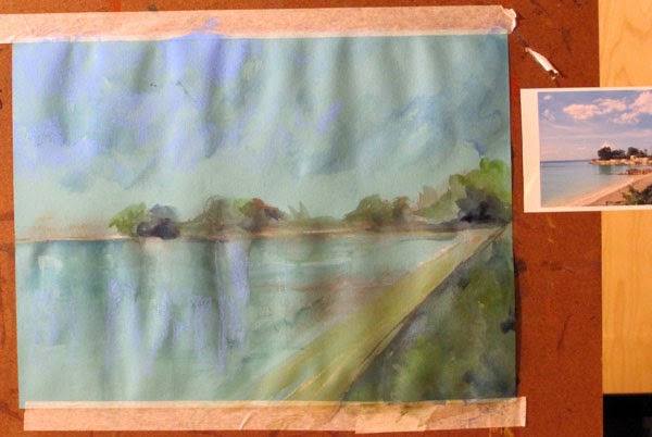
119. Bluefields in Pastel and Watercolour

Watercolour and Schminke Soft Pastels
on Daler Rowney Murano Paper, 16" x 12"

Work in progress images

Initially, wrinkly, crinkly!